Gwen + Don's bathroom
- Jennifer Anvari
- Aug 23, 2021
- 2 min read

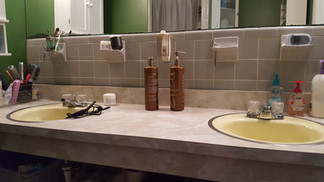
My parents have lived in the same house in Northern Virginia for my whole life. In fact, my dad moved into that house when he was a teenager! And in all that time, the bathrooms had never been updated. Here's their 1960s gem of a primary bathroom:
Despite the mid-century touches like the gray 4x4 and hex tiles and the original sconces, this bathroom...struggled. The corner shower left them bumping their elbows every day, and while the large mirror helped with light and depth perception, it was in rough shape. They decided it was time for a complete gut, and asked us to help them design a new plan that would feel fresh, bright, and open. Here's what we came up with!


We decided to go with a totally open plan. The space is really quite small, so we wanted to find ways to make it feel luxurious and spacious as possible. We chose a glossy white tile that we took all the way up to the ceiling. If we'd chosen contrasting tile for the shower or drywall for part of the bathroom, we would have had more lines bisecting the room and making it feel smaller. The tile helps it open all the way up.

The shower niches are another favorite part. Having them directly across from the door turns them into a gorgeous feature!

For upgrades in the space, we really leaned into the shower as a spa. We added dual showerheads, and turned the whole space into a wet room style bathroom. Since the room is small, there's no need for heaters or other warming accessories you'd find in a traditional doorless shower--the whole room warms up perfectly well. We also chose a curbless design to minimize trip hazards over time.

For final touches, we incorporated a vintage fire extinguisher that belonged to my grandfather, and decorative accents.

I love how open, fun, and relaxing this bathroom is now!
-Jennifer


Comentários